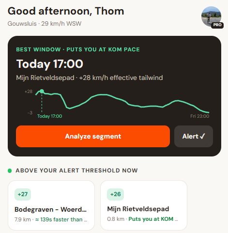
KOMpass was designed on a desktop, and on a phone it showed: the same cards, the same tables, just narrower. Most riders check the wind on their phone, often outside, often one-handed. So every screen has been rebuilt for that.
What changed
- Explore now leads with a results sheet you can drag up over the map. It lists the segments in view with their signed tailwind; tap a row and it expands in place with the numbers you'd otherwise have to open a panel for (required tailwind, record time and speed, grade, elevation, wind now). The same sheet doubles as the KOM finder, and filters and the forecast scrubber live behind their own buttons in its header.
- Dashboard opens with a verdict card instead of a grid: what the next window is actually worth on one of your segments, measured against your own best time, with a tailwind sparkline for the days ahead.
- Segments became one list with sort chips (best now, closest to alert, A–Z) and a status line per row. The bell on the row opens an alert sheet where you can arm it and set its threshold; the row itself opens the analysis, which is now split into Verdict, Pacing and Today.
- Alerts leads with an armed/paused card summarising your whole setup in one line. Every setting underneath opens a focused sheet with one decision in it, and quiet hours and skipped night forecast hours merged into a single overnight range.
- You replaces the old “More” menu. Settings is one scroll: your plan, rider profile, target leaderboard, units, appearance, docs, changelog and your data.
Docs and this changelog got mobile layouts too: docs are answer-first cards with search and category chips, and releases open in a sheet so you can read them without leaving the list.